by Melinda Yoo, Sungrown Studio
Dispensary layout plays a huge role in not only how the space will function from an employee and security point of view, but even more importantly, how your customers view their shopping experience with you and how your brand speaks to them. The way your dispensary looks matters and is often a key factor in boosting sales and standing out from your competition.
The dispensary floor plan you land on ultimately drives sales, tech application, experience, and employee retention. It is crucial to totally understand the three types of layouts, how they could work (or not work) for you and then how to implement them. Your end goal is always a positive customer experience, and state/local compliance. Not all states or municipalities allow all three of these models, so make sure you are aware of your regulations before dive too far into space planning.
Let’s review the three main types, pros and cons of each, how each specific layout drives customer experience, and how tech is integrated.
The Bank Layout
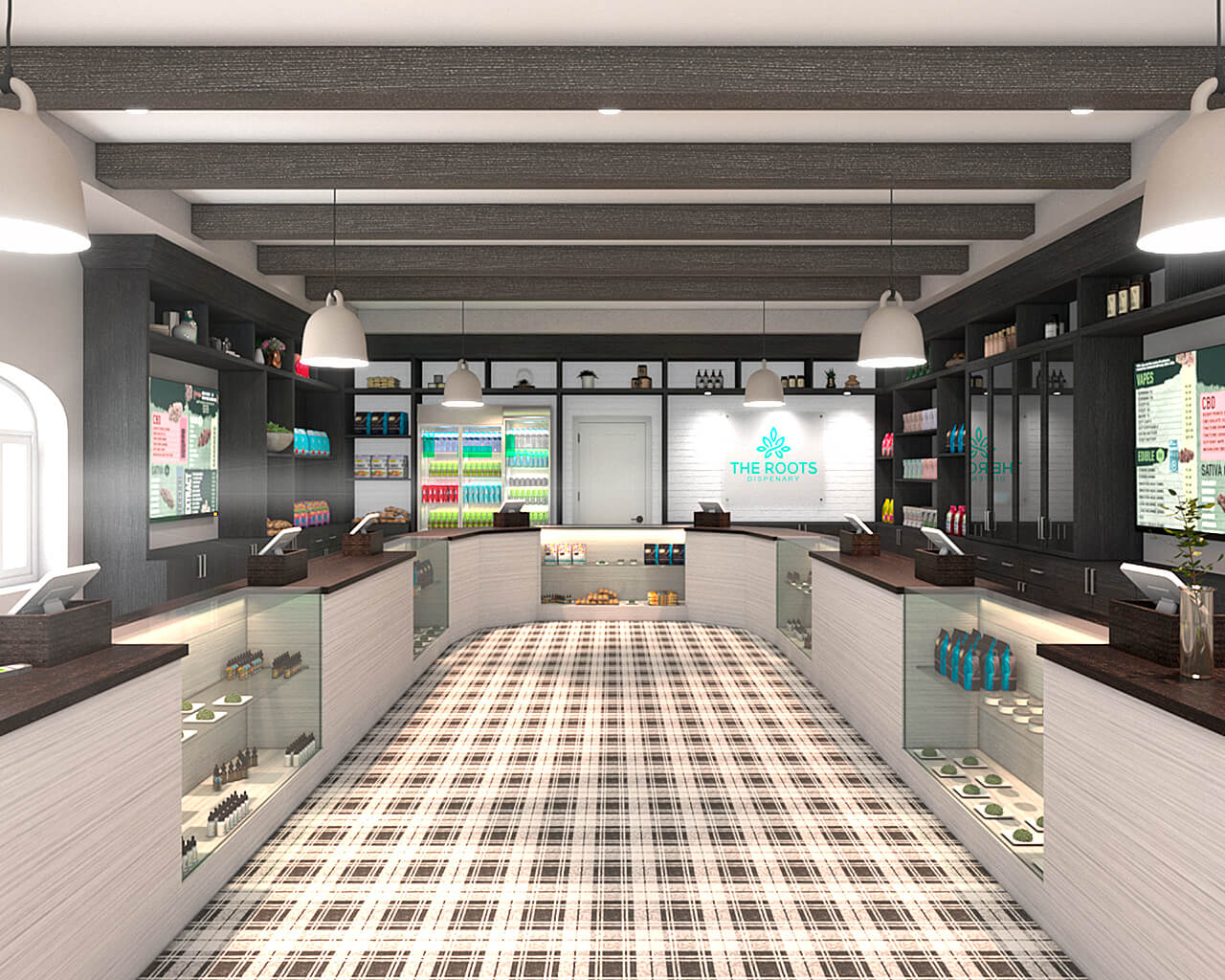
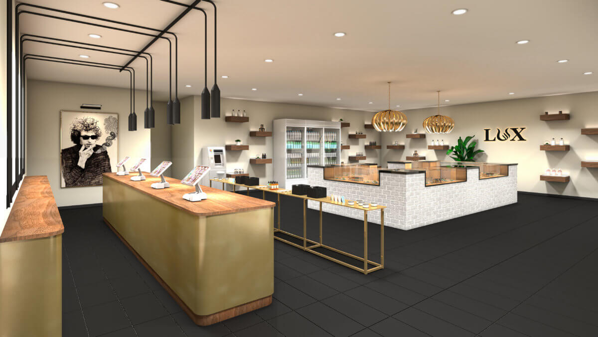
The bank dispensary layout is super common, and has a few easy-to-identify features. Picture your local bank and you’ll likely understand the flow. Your customer enters through a secure entry and waiting room. The product is neatly tucked into individual budtender stations, each with its own POS. This means that the customer is prompted to an open station, selects products, fulfilled right there by the budtender. Each budtender manages and reconciles their own inventory and till. The customer exits through the same door they entered, or a separate man-trap exit. The bank model can be a great shopping experience for the customer because they do benefit from a 1:1 budtender experience. Products are suggested and recommended, a trusting relationship is built and the shopping journey is both easy and personal. Tech is replicated at each identical station and any countertop display is also repeated. All product is securely stored behind glass.
Bank models do require custom case fabrication on the casework as well as behind-the-counter wall display. Your measurements will be unique to your space as well as your finish type, lighting, and branding.
The Pharmacy Dispensary Design
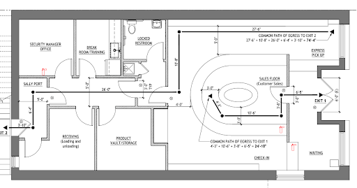
We are seeing more and more of the pharmacy layout because it offers great inventory advantages and customer shopping experience. In this layout, the customer walks in through a secured waiting area just as they did in the bank model, but upon entering the sales floor, they are able and encouraged to wander a bit. Budtenders meet them on the floor with digital shopping carts. Once the customer is done shopping, the employee completes the sales transaction and the order is fulfilled in the back of the house. The guest then reviews their order with another employee at the pickup counter and exits through the same door they entered, or a secured exit. This model works well for a few reasons. Inventory control as mentioned, but also specialized employees. You will have some employees trained specifically in selling and customer service and separate employees trained on cash handling and product review. Tech will speak to each other, the orders sent to the back of the house for fulfillment (think like a restaurant). Our example above is actually a hybrid model. In this location, the employees behind the cash wrap fulfill the order as well as take payment. The customer experience is great, they have more interaction with product and merchandise. It feels a little more like shopping freely, but very secure.
The Open Retail Model Dispensary Design
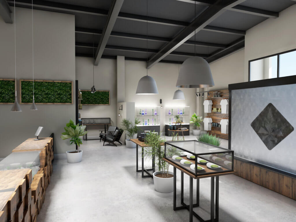
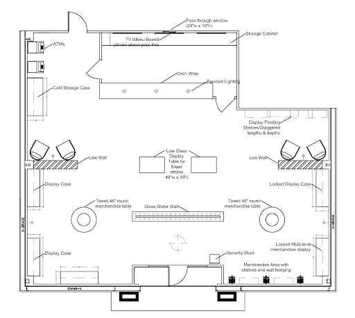
An Open Retail dispensary plan is really what we see in a true ‘Apple store’ layout. It is by far the most interactive, but also holds the highest operating costs. Many experiential dispensaries use this model, or a hybrid version of it. The customer will enter and provide ID, then freely wander through the sales floor. Dummy product (empty packaging for security reasons) is displayed, or products are in locked cases. They will fill a virtual shopping cart which is checked and entered by a budtender on the sales floor and filled back of house. Inventory is centrally located in the back of the house and managed. The guest pays at a central cash wrap area and the budtender meets them to review their purchase. This model is fun and interactive, but also requires more employees than typical to care for each guest. Security systems in place are also a cost factor, since you will likely require far more camera angles and security staff. From a customer point of view, this really is the most premium experience and can lead to high sales. You will be able to facilitate the impulse buying process easily.
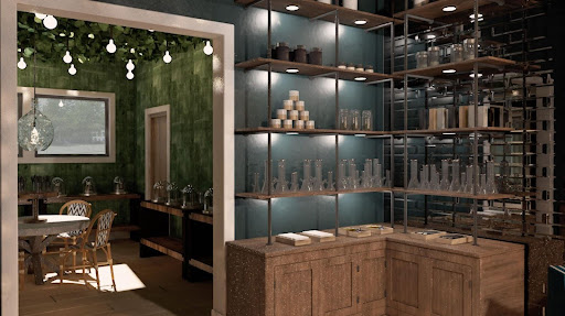
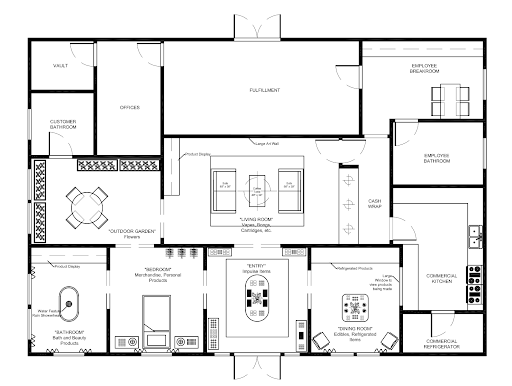
A few takeaways on the three types of dispensary layouts. First, every single one of these dispensary layouts can be done in any amount of square footage. You don’t need a massive open space to make any of these super functional and beautiful. All of these can be done successfully in any budget level if you have access to the right sources. If you’re trying to decide on a layout, remember the key components of each. How many employees will I need? How are inventory and fulfillment managed? Can my budtenders handle sales and cash transactions? What experience is my customer used to and what experience do I want my employees and guests to have? Is it compliant in my state? And last, if you love parts of one model and parts of another, each layout can be designed in a hybrid way to retain the best features that work for your unique brand.
 Melinda Yoo designs innovative, profitable and award-winning cannabis retail dispensaries across North America. Her work is inspiring, her clients are notable and her vision for the cannabis industry is unparalleled. She leads her team thoughtfully through the creative and technical processes of creating unique retail experiences that are both jaw dropping and profitable.
After over a decade at a traditional, residential interior design firm in Chicago, Melinda followed her curiosity to retail interior design and merchandising. She quickly fell in love with dispensary design and all the quirks and challenges that go with it.
Since then, she has grown and led Sungrown Studio, received press recognition with her magazine-worthy retail environments and thought leadership. Sungrown Studio was named Dispensary Design Master 2022 by mg Magazine. Melinda continues to design amazing retail stores that reflect her clients values and brand.
When she’s not leading her kickass team, you can find her spending time on the hiking trails with her dog or raising her three little humans.

Follow NCIA
Newsletter
Facebook
Twitter
LinkedIn
Instagram
–