Member Blog: “Don’t hate me because I’m beautiful!” (part 2 of 2)
by Kary Radestock, CEO of Hippo Premium Packaging
Celebrating excellence in branding, packaging and marketing within the cannabis industry
In part 1, we explored the development of the Canndescent brand and the steps they took to launch that gorgeous canna-business. Today, we turn our eyes to hmbldt, one of the most stunning brands to recently burst upon our burgeoning industry.
Last November, while walking through the MJ Business Expo in Vegas, one exhibit caught my eye. hmbldt. Actually, I couldn’t take my eyes off their logo. It was stunning in its simplicity. The one thing I can say about these guys is they don’t like vowels. Just kidding. They fricken’ nailed it!
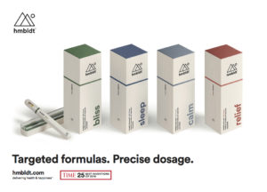 I loved the contemporary clean lines, the white space and the naming-by-effect convention. The packaging itself was a very well executed combination of color-coded rigid boxes with inserts, and folding carton sleeves.
When I see great work, I get excited! I know, I know… I’m just a branding and packaging geek, I can’t help myself!
Recently, I got a chance to talk to Derek McCarty, CMO of hmbldt, regarding their brand development. He credits their creative partners, Anomoly (2017 Agency of the year – Ad Age) with not only their brand and packaging development, but also the product development. “They are true strategic partners in every sense of the word,” he said. In fact, the agency has a stake in the company, as well as its founding member sitting on hmbldt’s board.
The first employee hired by hmbldt was Derek McCarty, a seasoned brand strategist. Hmmm… with priorities like that, no wonder hmbldt launched at the top of the heap. And it didn’t hurt that Time Magazine named their innovative vaping device one of the Top 25 Inventions of 2017.
“We launched in September and received the award in November. Of course, the award added credibility to the product and propelled sales throughout the state quickly. While we were extremely pleased with the award, we were elated that mainstream media led with the health benefits of cannabis in this instance,” Derek told me.
When asked how long it took to develop the brand, McCarty replied, “Our brand is a living, breathing, dynamic thing… the development will never stop. The hmbldt brand is the sum of all parts.”
And those are very nice parts, indeed.
Discussing his favorite cannabis brands, Derek cited Lord Jones and DeFonce as his favorites for product positioning, and Jetty and Bloom Farms as his choice for best benefit positioning. Adrian from Canndescent also touted Bloom Farms for strong messaging and PAX for overall brand and product positioning.
When I look at amazing brands like these, I like to believe there is something we can learn from them. I asked Derek what advice he would give to a fellow canna-prenuer on building a great brand. “Be creative in how you find strategic partners,” he said. “Look for a mutually beneficial, great value exchange. As with any great partnership, it must be a win-win for both sides.”
Adrian offered this advice. “Hold yourself to a simple standard that begins with compliance. Build a solid platform and write a good business plan. With that in place, the money and great people will follow, allowing you to create your own unique brand that solves a problem,” he said.
A world-class brand doesn’t just happen… let alone two. I’ve learned from these brands that they have succeeded by paying close attention to the details and focusing on quality in everything they do, in everything they touch. They chose their partners carefully and began with a compliant platform.
I am grateful to each of them for creating beauty in a rather barren landscape. For giving us greatness to aspire to and for helping to elevate the image of our industry just by entering it.
Thank you!
 Kary Radestock, CEO, launched Hippo Premium Packaging in March 2016 offering an array of services to the cannabis market, including: Marketing Strategy, Brand Development, Social Media, Public Relations, Graphic and Web Design, and of course, Printing and Packaging. Radestock brings over 20 years of award-winning print and packaging expertise, and leads a team of the nation’s top brand builders, marketers and print production experts. Hippo works with businesses looking for a brand refresh or an entire brand development, and specializes in helping canna-business get their products to market in the most beautiful and affordable way possible. Radestock’s Creative Collective of talent and experts, allows her to offer world-class solutions to support the unique needs of the Cannabis Industry.
Member Blog: Don’t hate me because I’m beautiful! (Part 1 of 2)
by Kary Radestock, CEO of Hippo Premium Packaging
Celebrating excellence in branding, packaging, and marketing within the cannabis industry
There is so much talk about the lack of sophisticated branding in the cannabis space. And while it is true that there are many look-alike logos and a plethora of cannabis leaves in way too many brands, there is some great work being produced that deserves to be recognized. This inaugural blog will highlight two brands that recently exploded on the scene that bring a sophistication that is often lacking in the cannabis sector. They are: hmbldt and Canndescent. We will look at Canndescent in Part 1 of this blog.
I was recently meeting with a client, Adam, a successful dispensary owner in San Diego, when in walks this beautifully branded, big glossy white, litho-wrapped, corrugated box with the word Canndescent on it.
I was awestruck. Adam opened it and said, “Wait until you look inside!” I was like a kid on Christmas morning as Adam unveiled a simple and tastefully branded 1 lb. flexible bag containing beautiful flowers.
 “Wow… Just wow,” was about all I could say.
About a month later back in his office, Adam whipped out a pretty little orange box and asked, “Why aren’t we doing something like this?” I grabbed the package from him and exclaimed, “Holy cow! This is amazing!”
I like to remember my initial exposure to a company – it’s the moment I first fall in love with the brand.
Canndescent, co-founded by Adrian Sedlin and his brother-in-law, was officially launched in September 2016 when the team secured a $6.5MM investment deal and opened the first municipally permitted cultivation facility in the state of California. I was recently fortunate enough to visit that facility and talk to Adrian at length.
I found out that this wasn’t Adrian’s first rodeo. Armed with an MBA from Harvard and four other successful businesses ventures under his belt, he turned his eye to the cannabis industry. “My partner heads up our grow team, who have a combined 200 years of cannabis growing experience. Our goal was to build an iconic brand that changes the way the industry is perceived,” he said.
By the time the money came in, the management team had already reviewed over 500 logos from an online search process (and no, the Canndescent logo you see was not among them). In addition, they had already decided on Sterling Brands, an award-winning, international brand development agency, to assist in their brand development.
“Sterling did an incredible job helping to build the brand DNA – the effects-based architecture to simplify the cannabis experience and cut through the noise,” Adrian commented. “This is an archaic industry, and the thousands of cannabis strains are confusing to the general consumer,” he added. “Great brands are created to solve a problem. Canndescent makes a brand promise to help our customers curate their own cannabis-induced experience, while simplifying the process.”
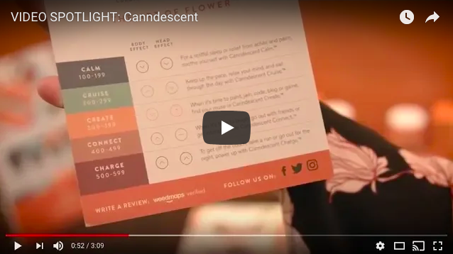
With effect names like Calm, Cruise, Create, Connect and Charge, the consumer can easily choose the appropriate product based on how they wish to feel at any given time. It takes the guessing game out of the equation.
Adrian admitted that the logo was derived from all the “C’s.”
“When those C’s were placed together in the winning pattern, they created the look we were going for. We wanted an icon that could stand alone as well as work as a pattern, like Louis Vuitton and Gucci,” he said. “Plus, the logo even looks a bit like a flower, which is the product we are selling!”
The Canndescent marketing team took their cues from great fashion houses: the color system was inspired by Tory Burch and Hermes, while the numbering system by Chanel. “Plagiarism is stealing from one, creativity is stealing from all,” Adrian laughed.
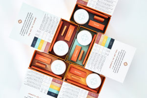
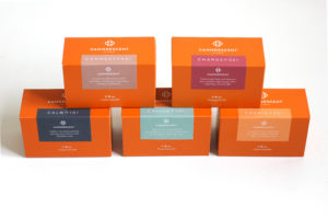
Their cannabis kits (folding cartons with magnetic closures) are fully versioned by effect name and a corresponding color-coding system. The outer labels contain tasting notes to further describe the experience. For example, Calm 101 reads: “Sedates the mind and body allowing the world to melt blissfully away.” Nice, right?
 I bought it… literally. There is extensive detail put into the packaging of the kits’ various pieces (flower jar, matches, rolling papers and hemp wick). On the rolling papers, you’ll find a quotation relevant to the category containing the effect name. It’s like a little surprise… that Ah Ha! moment that makes you smile and makes you fall in love with the brand just a little bit more.
“Your brand is a point of view that is reflected in every choice that a company makes: every touch, every time.” Adrian said. The word Can(n)descent means to project light. I asked him where he’d like to see the company in five years and he replied, ”I’d like to think that the logo would be a recognizable icon and become a beacon to society for living in love and gratitude.”
In looking at the Canndescent brand development process, we see what’s possible when you combine vision, expertise and execution – when extraordinary attention to detail and quality production is a top company focus. For all their hard work, we get to see excellence in branding and a big step forward towards elevating the image of the cannabis industry.
Thank you, Canndescent team! May your light forever shine brightly.
EDITOR’S NOTE: The author chose her subject as an example of best practices in branding and design. The subject is not a client of her firm.
Kary Radestock, CEO, launched Hippo Premium Packaging in March 2016 offering an array of services to the cannabis market, including: Marketing Strategy, Brand Development, Social Media, Public Relations, Graphic and Web Design, and of course, Printing and Packaging. Radestock brings over 20 years of award-winning print and packaging expertise, and leads a team of the nation’s top brand builders, marketers and print production experts. Hippo works with businesses looking for a brand refresh or an entire brand development, and specializes in helping canna-business get their products to market in the most beautiful and affordable way possible. Radestock’s Creative Collective of talent and experts, allows her to offer world-class solutions to support the unique needs of the Cannabis Industry.
Follow NCIA
Newsletter
Facebook
Twitter
LinkedIn
Instagram
News & Resource Topics
–
This Just In
NCIA Applauds Reintroduction of SAFE Banking Following Lobby Days
Beyond Rescheduling: Inside NCIA’s 14th Annual National Cannabis Industry Lobby Days